 (Image via
You see them every day, stuck to grilles, trunks, and steering wheels, but have you ever really looked at a car logo? That little piece of chrome or plastic is more than just a brand name; it’s a symbol packed with history, meaning, and sometimes, a few hidden secrets. These emblems are like tiny works of art that tell a story about where the car came from and what it stands for.
From prancing horses to interlocking rings, the world of car logos is seriously fascinating. It’s a mix of clever design, local pride, and epic history lessons all rolled into one. Let's pop the hood on some of the most iconic car logos and uncover the stories behind them.
Mercedes-Benz: The Three-Pointed Star
The Mercedes-Benz three-pointed star is pure class. It’s one of the most recognized logos in the world, and its origin story is all about ambition. The logo comes from a postcard sent by Gottlieb Daimler, one of the company's founders, to his wife in the 1870s. He drew a star over a picture of their house and wrote that one day, this star would shine over his own factory, symbolizing prosperity.
But the three points aren’t just random; they have a specific, powerful meaning. They represent the Daimler company's goal to dominate land, sea, and air with their engines. It was a bold vision for the future, and the simple, elegant star perfectly captures that ambition. Every time you see it, you’re looking at a symbol of engineering dominance that’s over a century old.
BMW: Bavarian Pride or Spinning Propeller?
There’s a ton of debate around the BMW logo, but the story is pretty cool either way. The classic tale you’ve probably heard is that the blue and white roundel represents a spinning airplane propeller against a blue sky. This makes sense, as BMW (Bayerische Motoren Werke, or Bavarian Motor Works) started out building aircraft engines during World War I. For years, even BMW leaned into this story in its advertising.
However, the real origin is a bit more straightforward, though just as interesting. The logo is a tribute to the company’s home state of Bavaria in Germany. The blue and white checkered pattern is taken directly from the Bavarian flag. Due to trademark laws at the time, they couldn’t just use the state flag, so they flipped the colors and arranged them in the now-famous quadrant design. So, is it a propeller or a flag? The official answer is the flag, but the propeller story is so iconic that it has become part of the brand’s legend.
Ferrari: The Prancing Horse of a War Hero
The Ferrari logo is pure passion and power. The famous Cavallino Rampante, or "prancing horse," is one of the most evocative symbols in the automotive world, but its story begins in the skies of World War I, not on a racetrack. The black horse was the personal emblem of Count Francesco Baracca, a legendary Italian fighter pilot. He painted it on the side of his plane for good luck.
So how did it end up on a Ferrari? In 1923, a young Enzo Ferrari won a race and met Count Baracca's parents. The hero's mother told Enzo, "Ferrari, put my son's prancing horse on your cars. It will bring you good luck." He took her advice. The yellow background was added because it's the official color of Modena, Enzo Ferrari's hometown. The Italian flag at the top seals the deal. It’s a logo born from heroism, luck, and national pride.
Lamborghini: The Raging Bull
If Ferrari is the prancing horse, Lamborghini is the raging bull. The story behind Lamborghini's logo is a classic tale of rivalry. Ferruccio Lamborghini was a wealthy tractor manufacturer who owned a Ferrari. When he had issues with the car's clutch, he tried to offer Enzo Ferrari some advice on how to improve it. Enzo, in his famously proud way, basically told the tractor-maker to stick to what he knew.
Furious, Ferruccio decided he would build a better sports car himself. When it came time to create a logo, he chose a bull for a few reasons.
- His Zodiac Sign: Ferruccio was a Taurus, the bull.
- A Love for Bullfighting: He was a huge fan of Spanish bullfighting.
- The Perfect Rival: What better symbol to compete against a prancing horse than a powerful, aggressive bull?
Many of Lamborghini's most famous models, like the Miura, Diablo, and Murciélago, are named after famous fighting bulls, continuing the tradition.
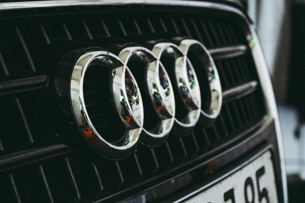
Audi: The Four Rings of Unity
The four interlocking rings of the Audi logo look simple, but they represent a complex history of collaboration. The logo doesn’t stand for a single company but for the 1932 merger of four independent German car manufacturers: Audi, DKW, Horch, and Wanderer. They joined forces to create the Auto Union AG.
Each ring represents one of the four founding companies. They are interlocked to symbolize their inseparable unity. After World War II, the company was re-established and eventually evolved into the Audi we know today. The logo was simplified over the years, but the four rings remain as a powerful and direct link to the brand's origins, reminding everyone that strength comes from unity.
Volkswagen: The People's Car
The Volkswagen logo is simple and effective. The "V" placed over a "W" clearly spells out the company's name. But the name itself tells the real story. Volkswagen means "people's car" in German. The company was founded in the 1930s with the goal of producing a simple, affordable car that the average German family could own. The result was the iconic Beetle.
The logo embodies this mission. It’s not flashy or complicated. It’s straightforward, accessible, and friendly, just like the cars it was meant to represent. The clean lines and circular design have been updated over the years to feel more modern, but the core "VW" has remained a constant, authentic symbol of mobility for everyone.
These logos are so much more than branding. They are historical artifacts, carrying stories of ambition, rivalry, unity, and pride. The next time you see one cruise by, you’ll know it’s not just a car—it’s a piece of history on wheels.